EN:
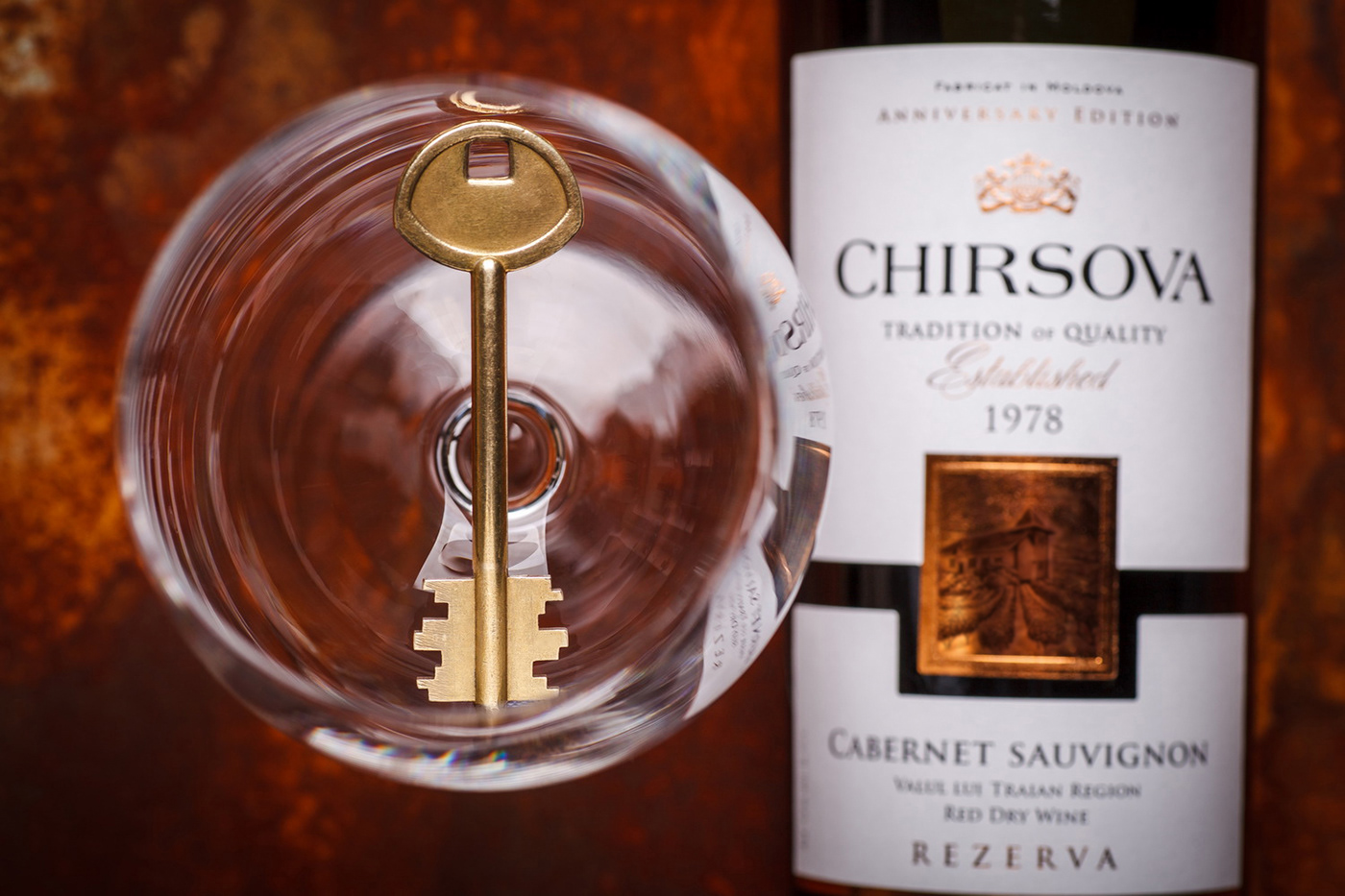
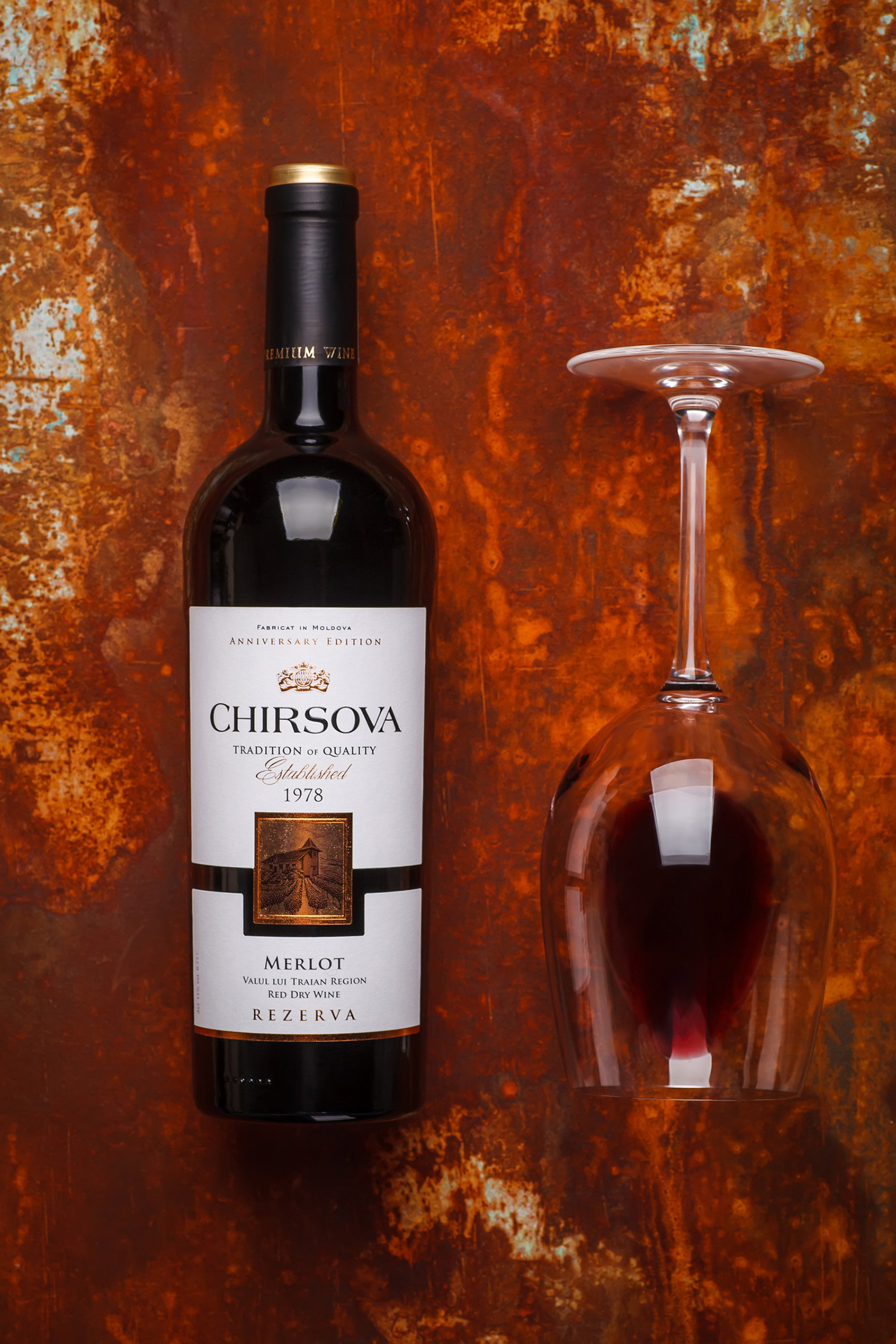
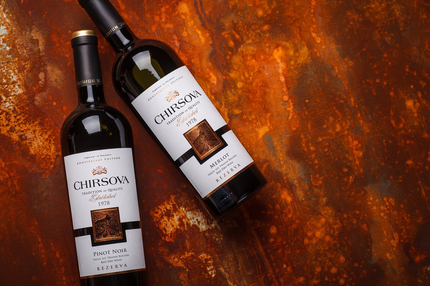
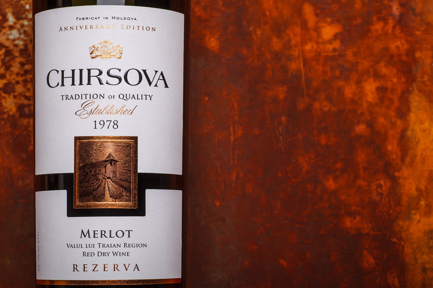
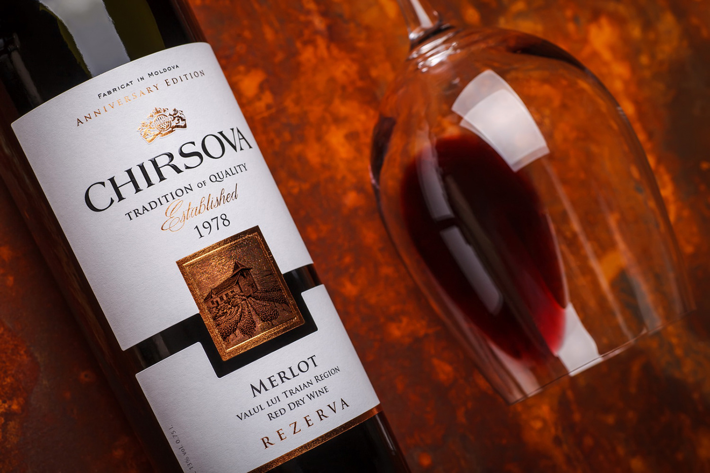
The second series of Chirsova wines dedicated to the 40-year anniversary of the winemaking company is devoted exclusively to the classic wine varieties of the Old World with their more traditional character and flavor. That is why we’ve focused on creating a design that would accurately reflect this concept, all the while emphasizing the modern spirit of the product and its particular place of origin.
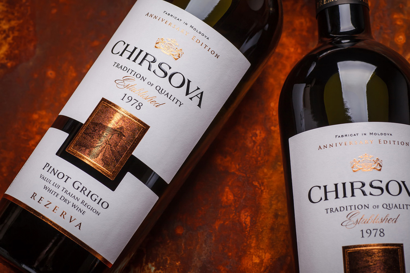
In general terms, the label design for the second anniversary Chirsova wine series follows the visual cannon of Old World wines with their minimalistic approach to color schemes, type fonts, and info elements. However, thanks to the use of a custom label shape and a set of modern post-printing techniques for highlighting certain elements, the general composition looks quite relevant and allows the product to stand out from the competition.
RU:
Вторая серия вин Chirsova, выпущенная к 40-летию винодельческого предприятия, посвящена исключительно классическим сортам Старого Света и традиционным вкусовым характеристикам. Поэтому мы сосредоточились на создании визуального оформления, которое бы четко передало данную концепцию, при этом подчеркивая современный характер продукта и его географическую принадлежность.
В общих чертах, дизайн этикетки для юбилейных вин Chirsova следует канонам оформления вин Старого Света с их минималистичным подходом к цветовой схеме, шрифтовым решениям, и информационным блокам. Однако, за счёт особой высечки этикетки, и применения современных пост-печатных процессов для выделения некоторых элементов, общая композиция выглядит релеванто и позволяет выделить вино на продуктовой полке.